University Project University of Applied Sciences, Information architecture and visualization
Year 2017
Tasks Analysis, DataViz
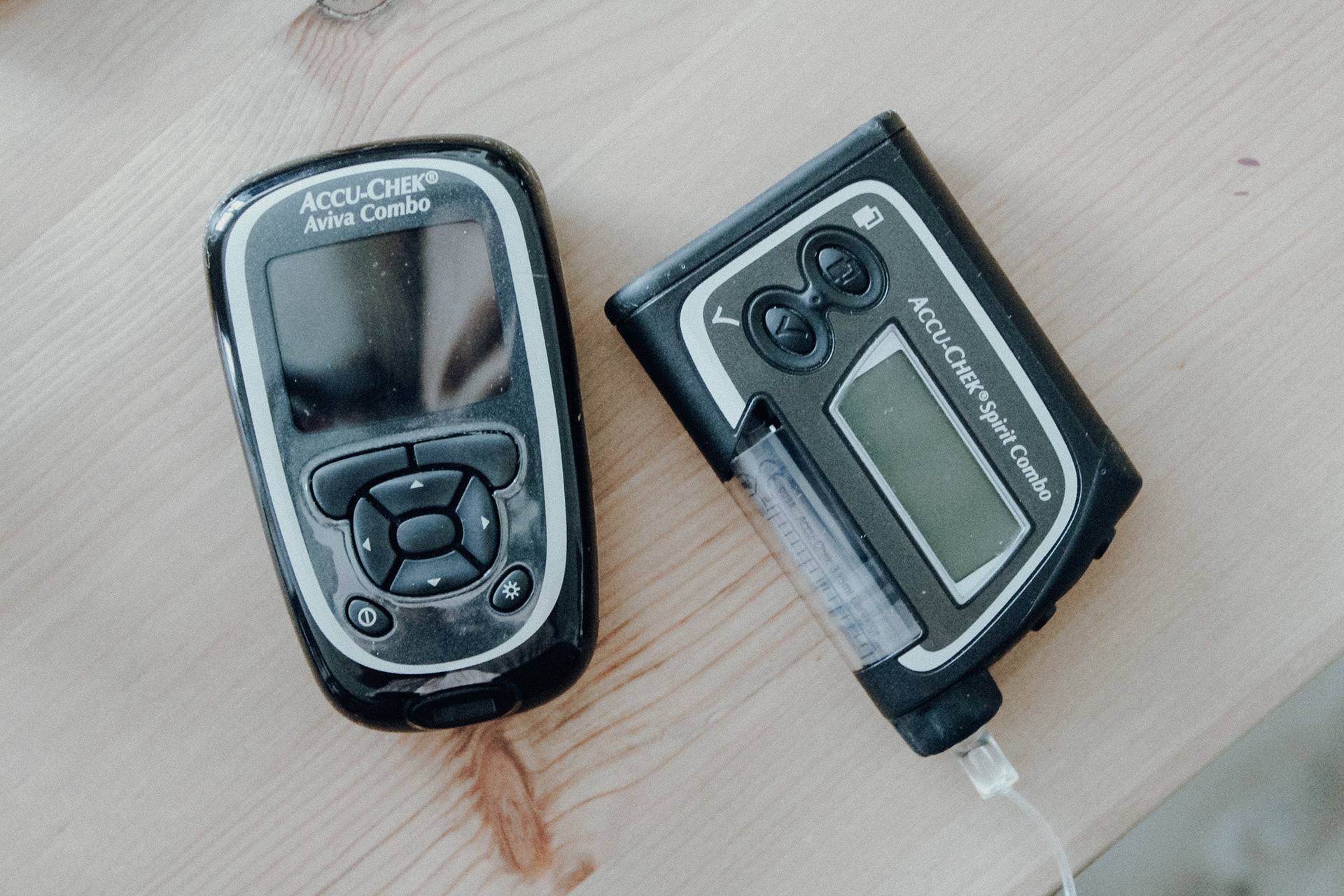
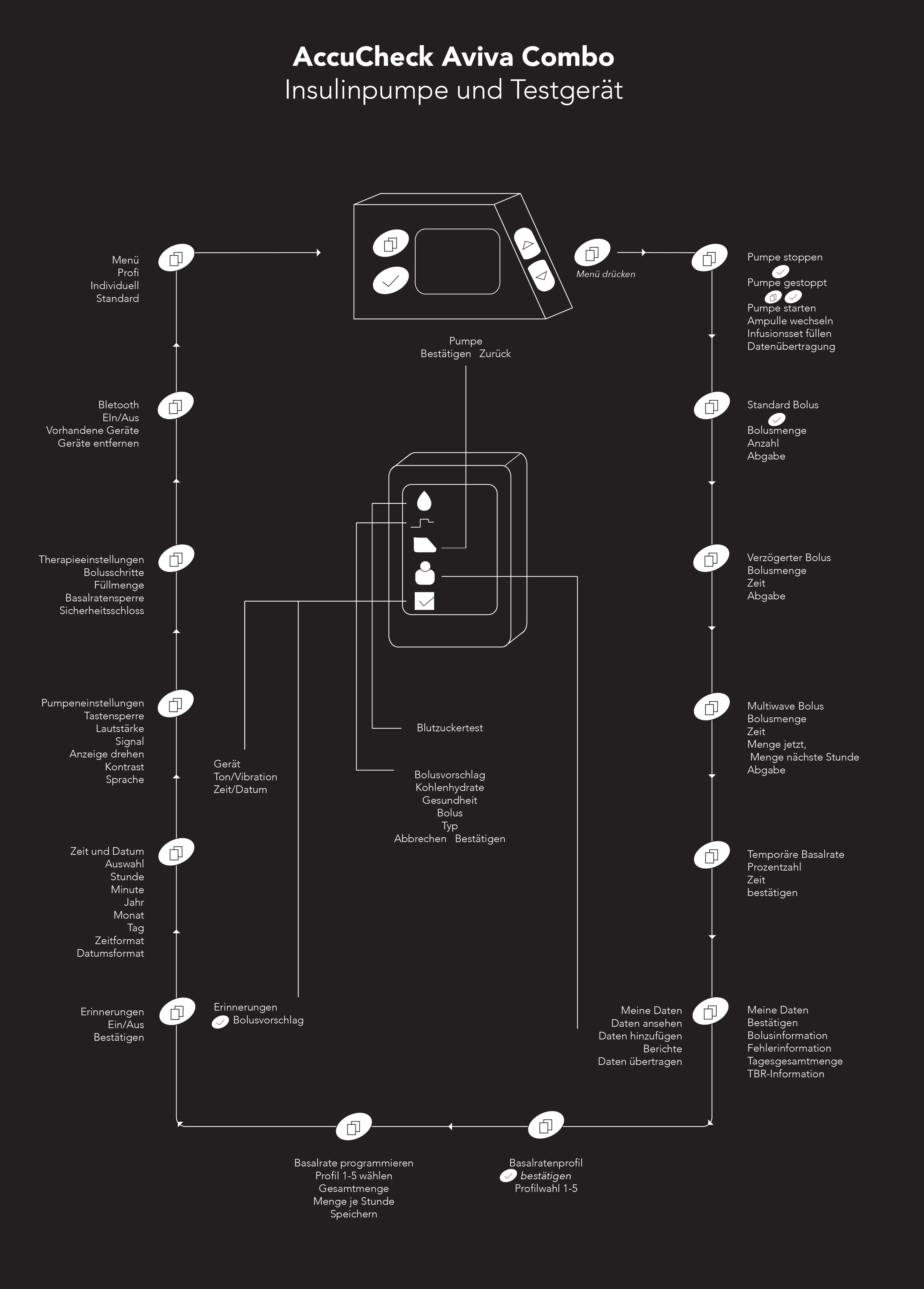
After living 8 years with Diabetes Type 1 and 5 years of that with the Accu-Chek Spirit Combo insulinpump, I decided to analyse the functions of the pump and the corresponding blood glucose measuring device. Because I have been dealing with this device for years on a daily basis, but do not know all the functions and how everything works together. There are a lot of instruction books, but in none of them is the whole spectrum of functions displayed.
In my analysis, the main focus is not on analyzation of the test device, but the connection of both devices to each other. The test device has a Bluetooth function that allows you to send the calculated suggestion of an amount of insulin to the pump. Thus, one only has to operate the tester and no longer approach the pump.
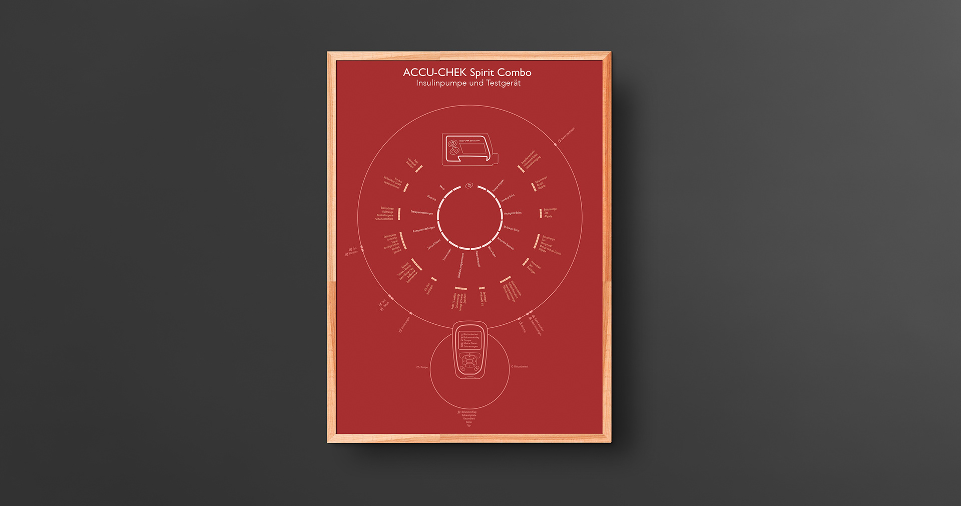
OVERVIEW OF THE SETTINGS
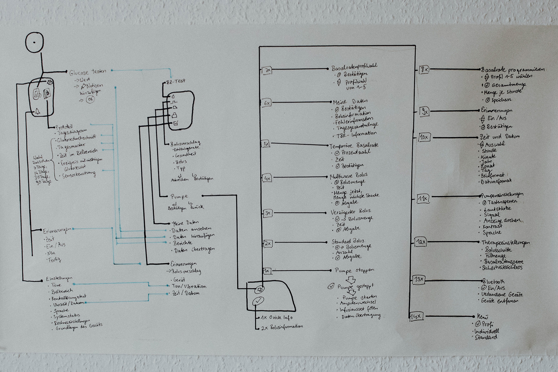
In order to find out all functions of the device and their connections, I first had to test the device in detail and document everything.
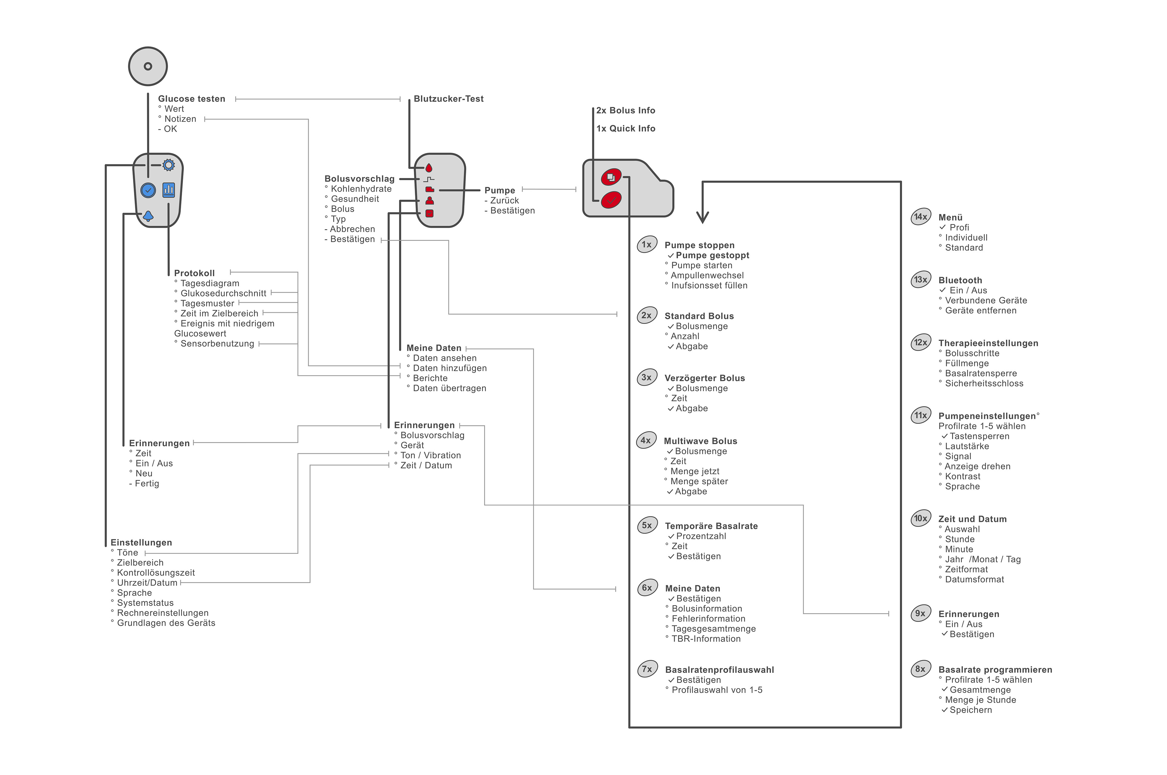
I wrote down all the functions by hand on a large sheet and connected them. On the left I also analyzed the glucose sensor, another deice I use daily, to have all data in one place. Already at the sighting of the material some difficulties were to be recognized. Further the pump has only one menu button, which changes the menu item depending on how often you press the button. I started to write down the menu items with the sub-items in the middle, but because of a lack of space I had to continue writing from top to bottom. This division does not really make sense, but has helped me to think of a better principle for the poster.
VIZUALISATION
In a further step, I thought about how I could present everything better. Since the menu of the pump is a circle in which one presses on a button to get to the next menu point and has to go through this circle once to be back to the beginning, I have changed the shape. In a first sketch, I have looked at how the representation looks roughly.
The first rectangle became a circle in the final viz. I also re-adjusted the first illustrations of the pump and the measuring device based on photos. It was noticeable that I forgot two buttons on the review unit, because I never use them.
The first rectangle became a circle in the final viz. I also re-adjusted the first illustrations of the pump and the measuring device based on photos. It was noticeable that I forgot two buttons on the review unit, because I never use them.
Process Step 1: Overview
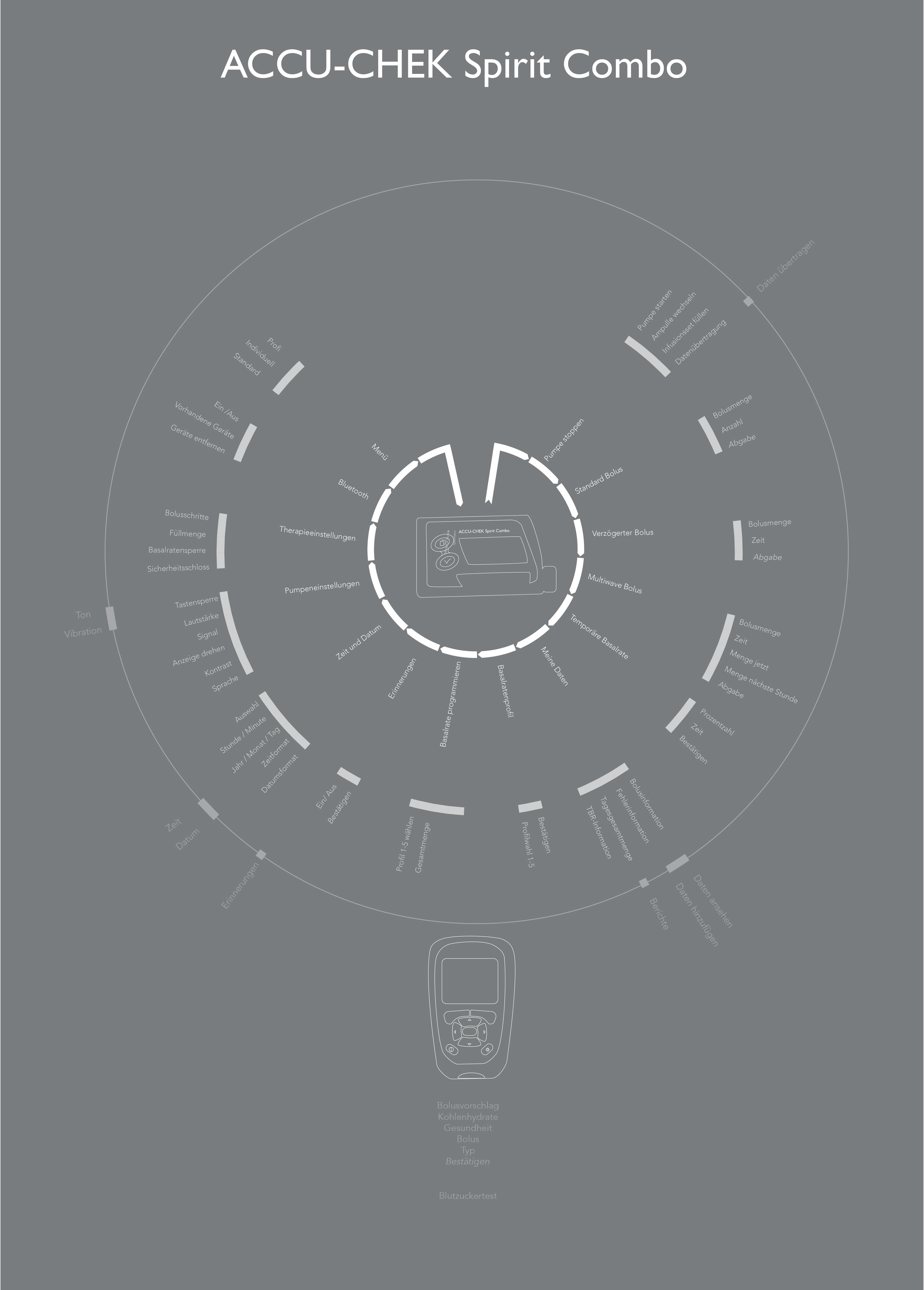
Process Step 2: First Viz
Process Step 3: Final Arrangement
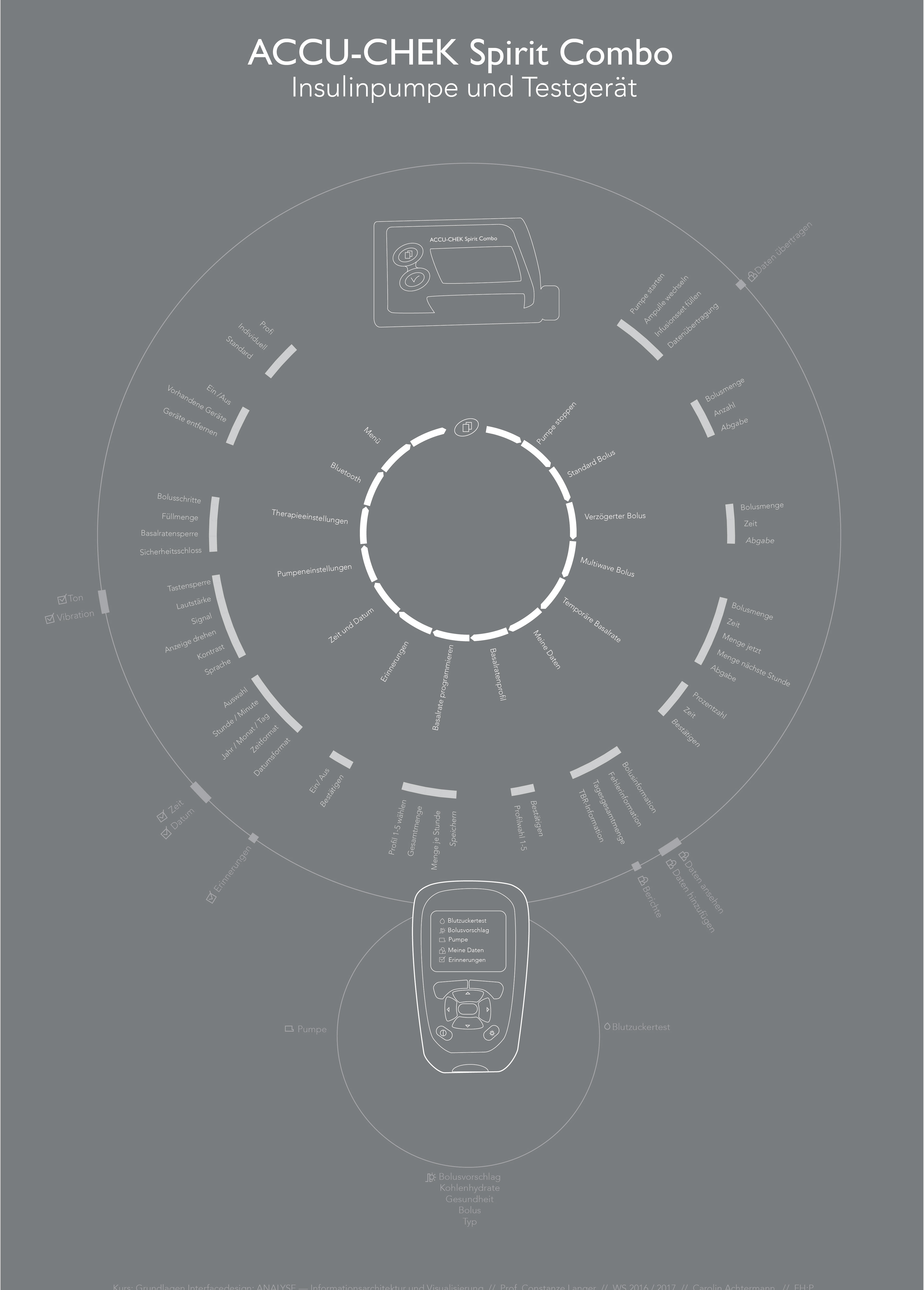
I arranged everything so that my presentation consists of a total of three circles. The inner circle shows the main menu of the pump. By pressing the menu button in the main menu, you continue until you are back at the beginning. Means that if you miss the desired menu item, you have to click through again from the beginning.
The second circle shows the submenus of the main menu, which always adjoin the outside of the menu.
For comparison, I placed the glucosemeter's menu items in the outermost circle to see where the points overlap. Since I partially compared sub-points, I added the icons of the menu items of the test device to be able to assign everything.