University Project: Malmö University, Playful Interactions
Year 2019
Tasksoncept, My focus in this project was on the concept of the game, the preparation of svgs to design the in-game feeling, the User Testing, writing the reports and creating the video with Florian.
Team Florian Dymke, Johan Helgren, Alexander Grövnes
Pontus is an educational typography game which has the goal to teach about different definitions in letters and typefaces in a historical context. The objective of the game is to shoot the right characteristic of the letters with ink.
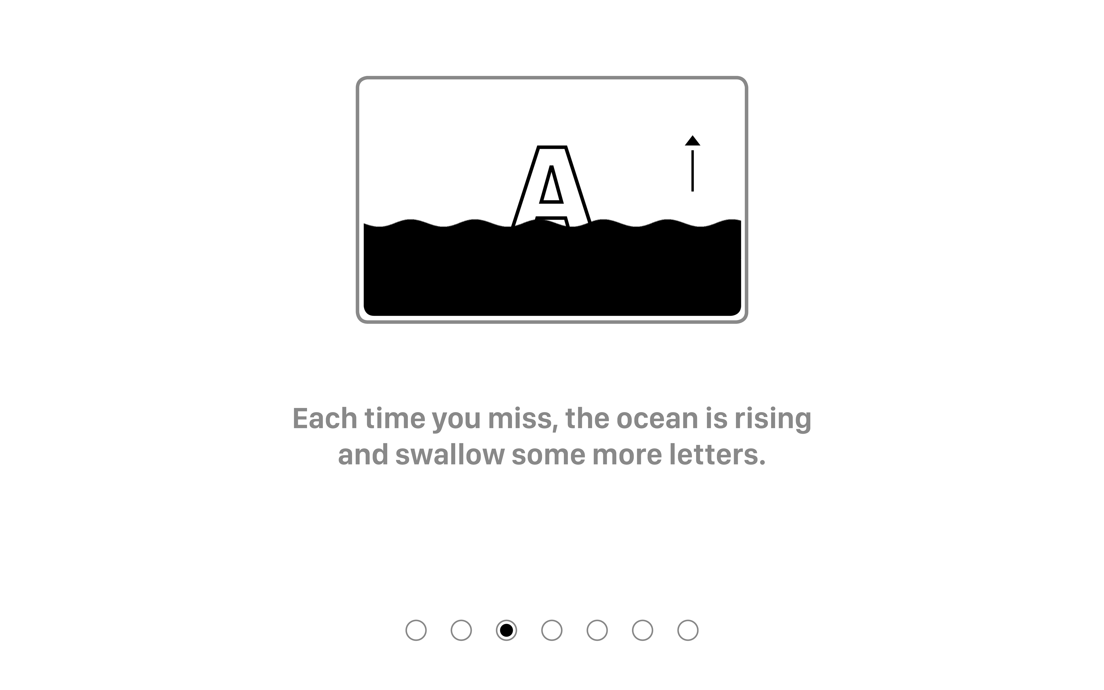
For example, the game could ask you to find the bowl of a letter, then you have to aim at that part of a letter and shoot it. To aim and shoot the letters, the user has to turn a controller in different directions to make the reticle move in the game. The player needs to shoot as many correct definitions as possible before the game ends, but at the same time, they need to keep track of the ink ocean rising if they miss or shoot the incorrect letter types.
PROCESS
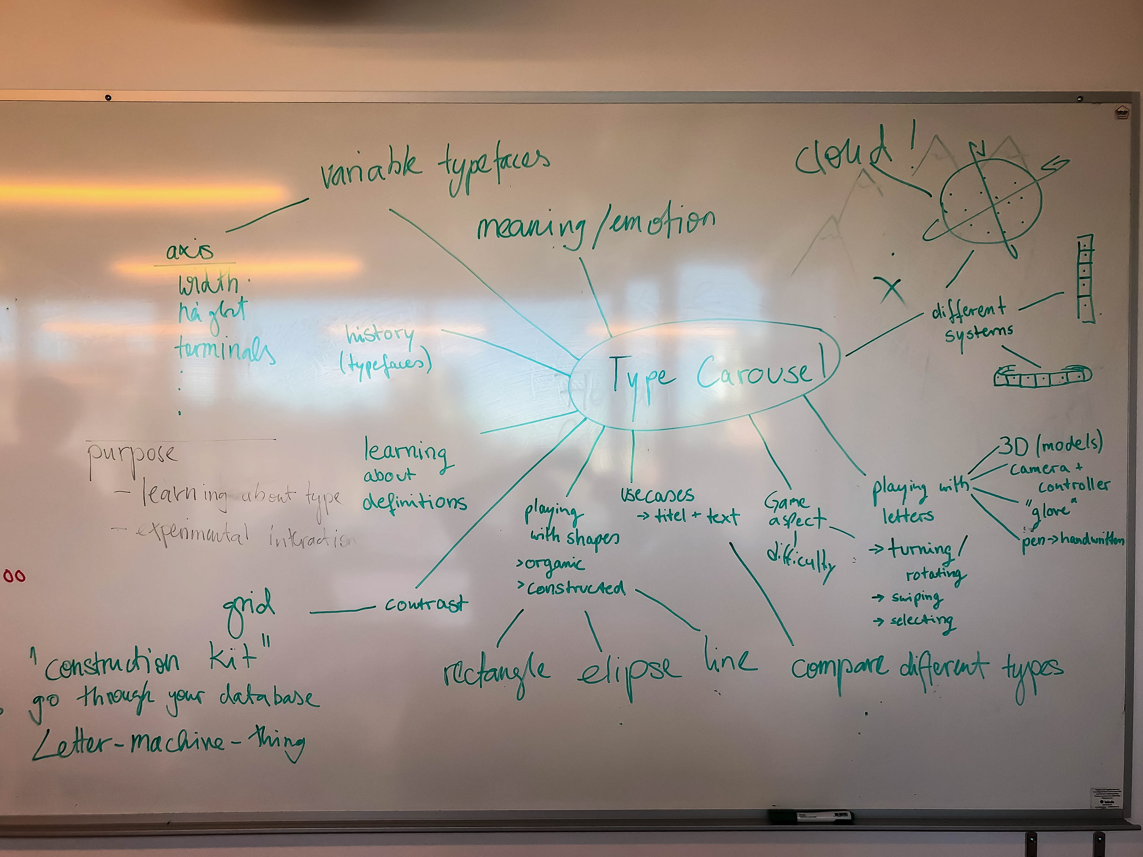
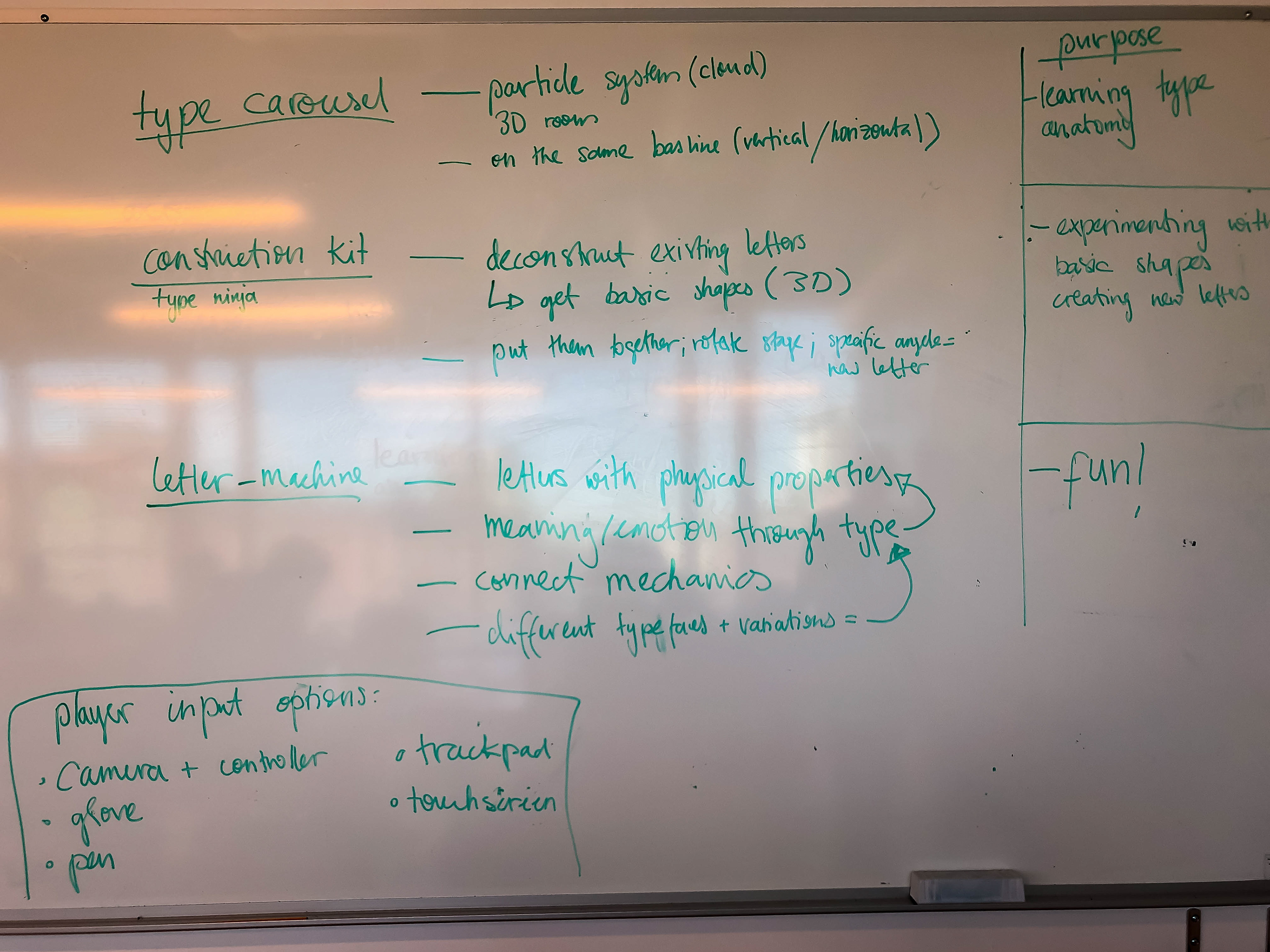
We started with an ideation phase and tried to brainstorm after the first idea of having a letter game with ink. The main focus was on the interaction between the player and the interface. Later we wanted to add an educational part and tested different aspects in the user testing for that.
We sketched scenes with different interactions between the user and the game before starting to work on the first digital prototype. At first the user could move the body, which was tracked with a camera and connected to the movement of the canvas with the letters. Also we wanted to implement the feature of turning a letter to fill a different part with ink. This should be done by moving hands or making gestures.
To see if our concept works in general, we built first a quick paper prototype and tried out the movements of the drop and letters.
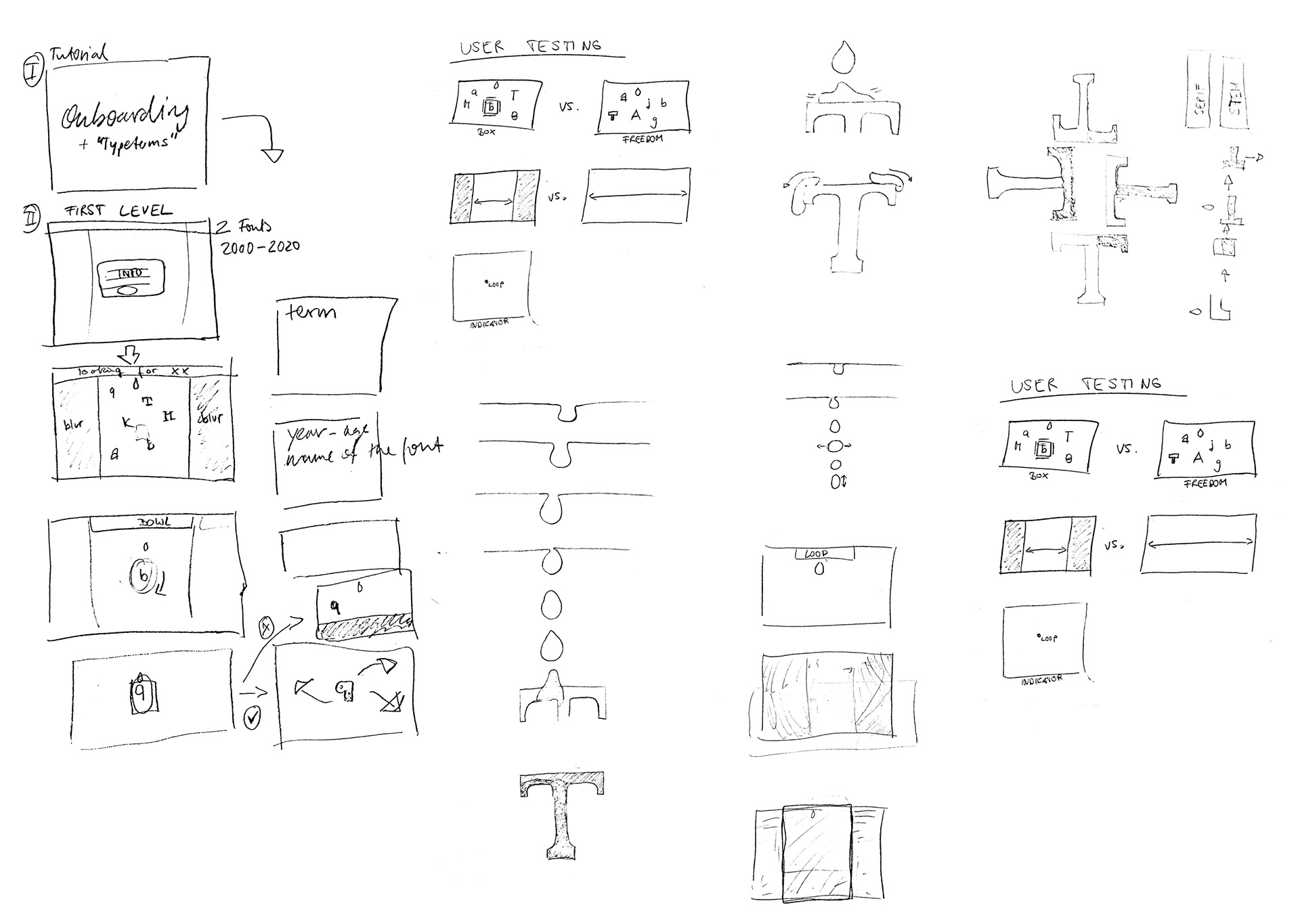
Scene Sketches

Paperprototype
After the sketches and paperprototype, we started building the first digital prototype. It was controlled by the keyboard on the laptop at first and we faked the movements in front of the big screen, just to try which movements feel normal. After a short time, we felt that it was confusing for the player to not have something in the hand to control the game with. That was when we knew, that it would be better to have a controller. Also we discussed a lot about the concept of moving the canvas, because the drop could not fall normal from the top when the canvas is moving. So to shoot the ink instead of having a drop falling and also do move a point on the canvas instead was our solution and we implemented these insights in our next prototyping step.
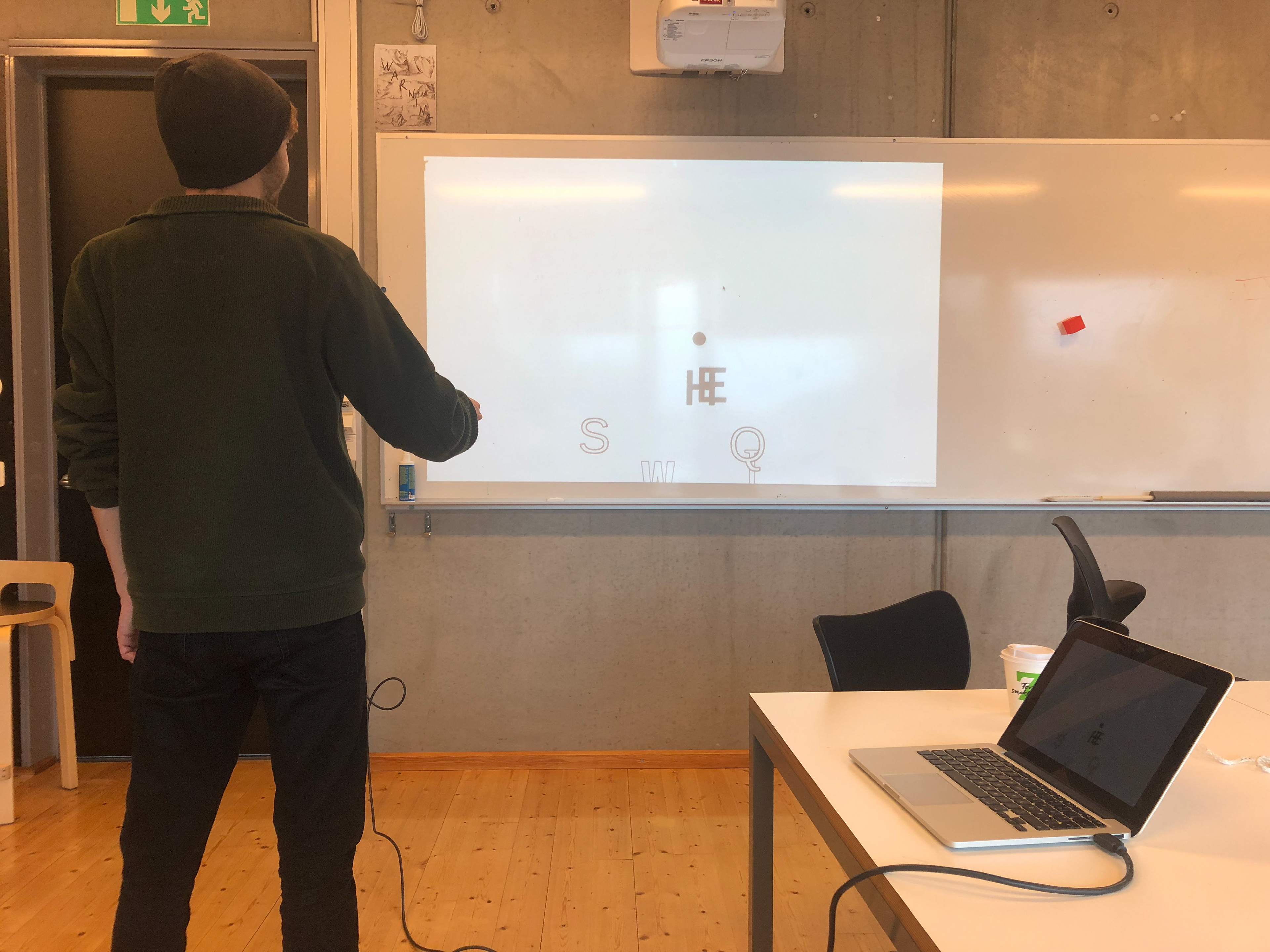
playtesting the first digital version
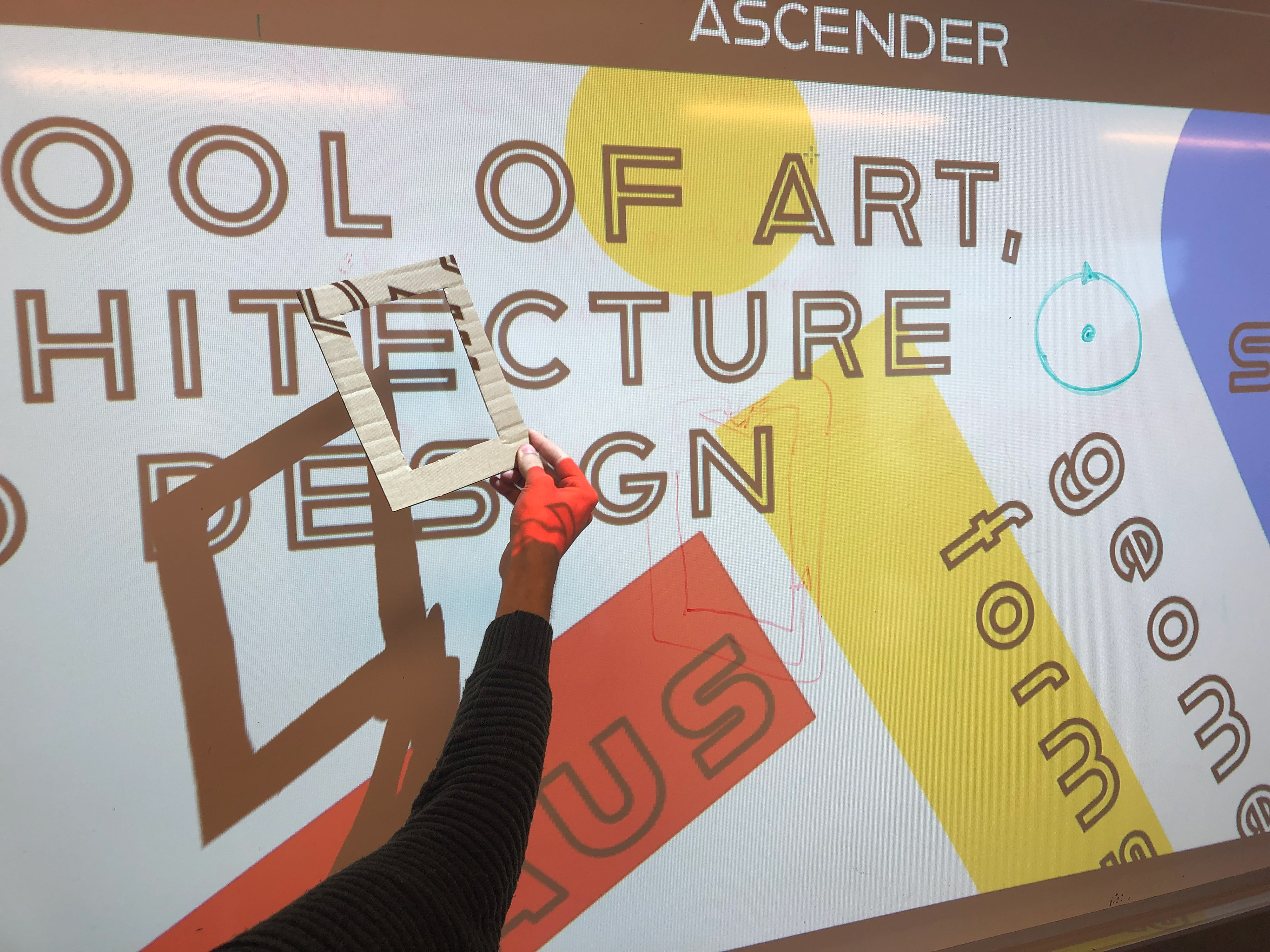
discussing the controller
PROTOTYPE
The prototype consists of two different parts which work together:
- The digital prototype (the interface)
- and a physical controller.
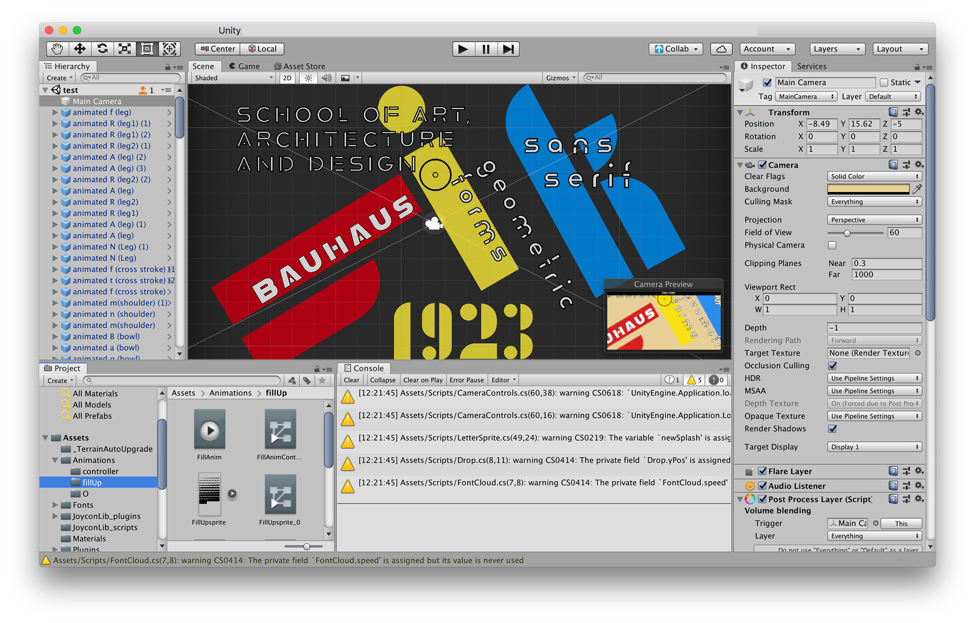
The digital prototype is built in Unity and shows a layer with different typefaces on it. The letters are separated in different parts (according to the different definitions). On the screen is a circle as the focus point, which can be moved by the controller. The game is displayed on a wall in the size 120x180cm, the player has to stand in front of it to play the game.
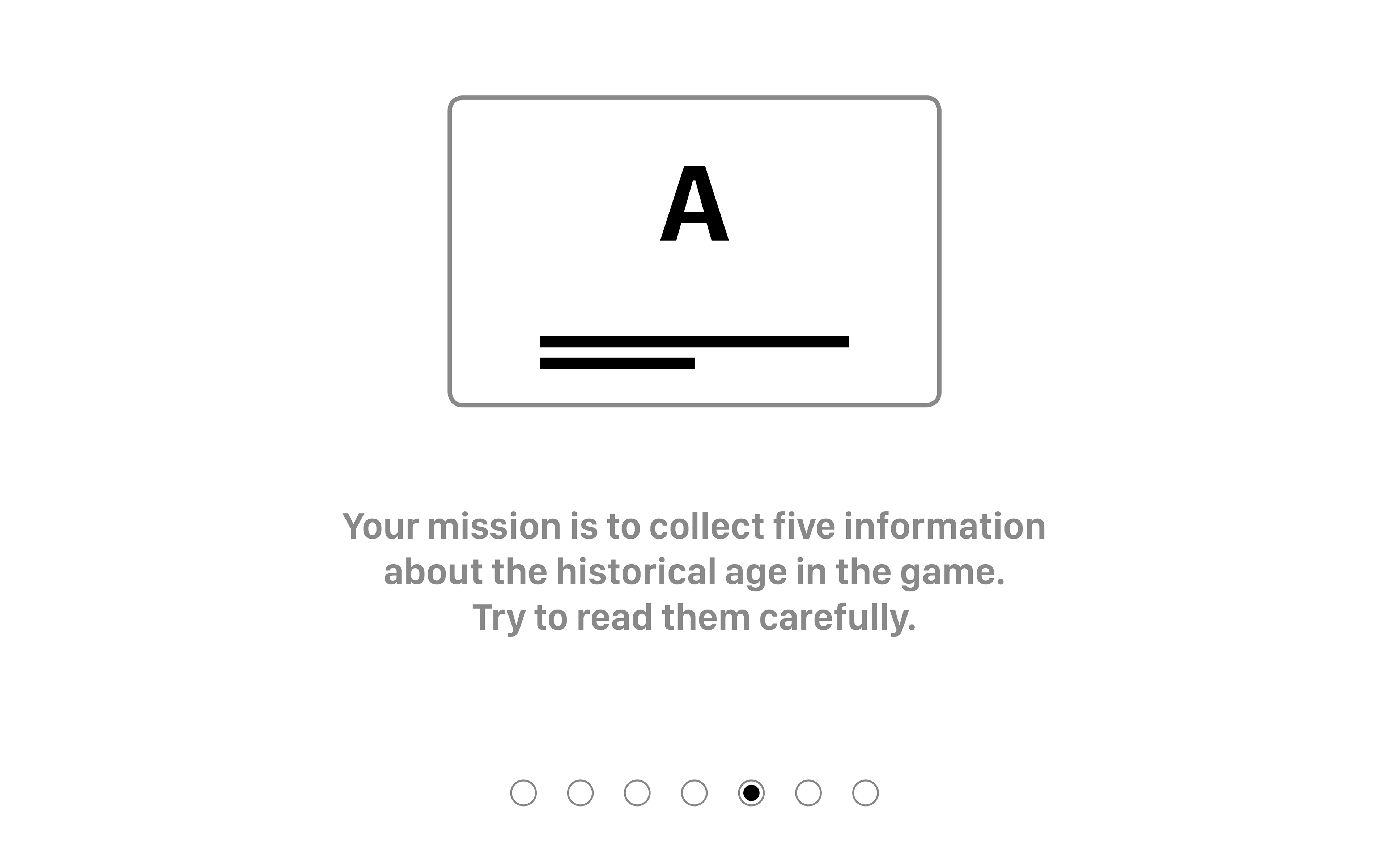
Our prototyped level in the game is in the historical context of the Bauhaus decade and shows therefore different typefaces like Xants Regular, Reross Quadratic and Alfarn Regular. Words which represent information about the Bauhaus decade are shown on the screen. In the background are a few colourful letters to represent the context and as graphical elements.
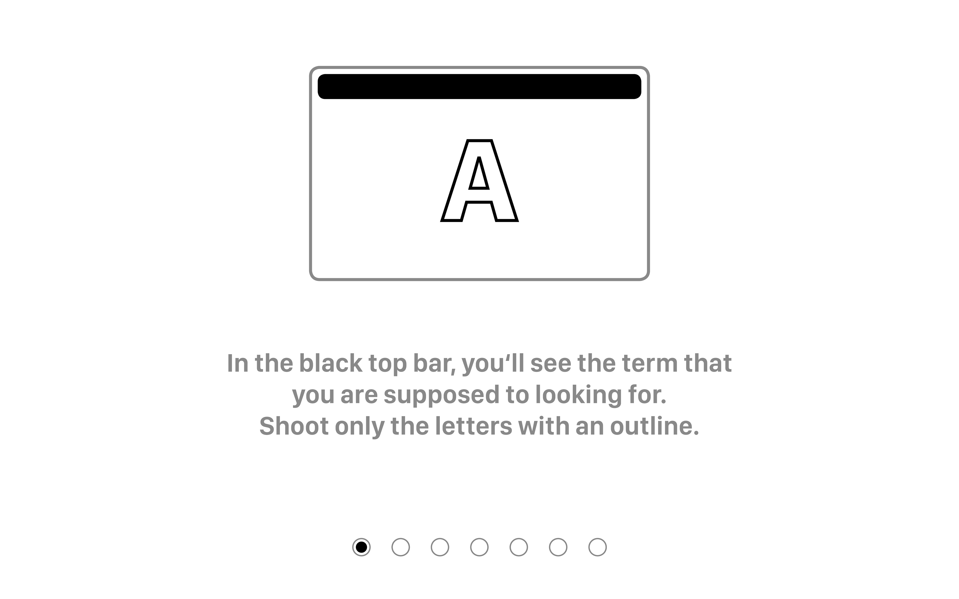
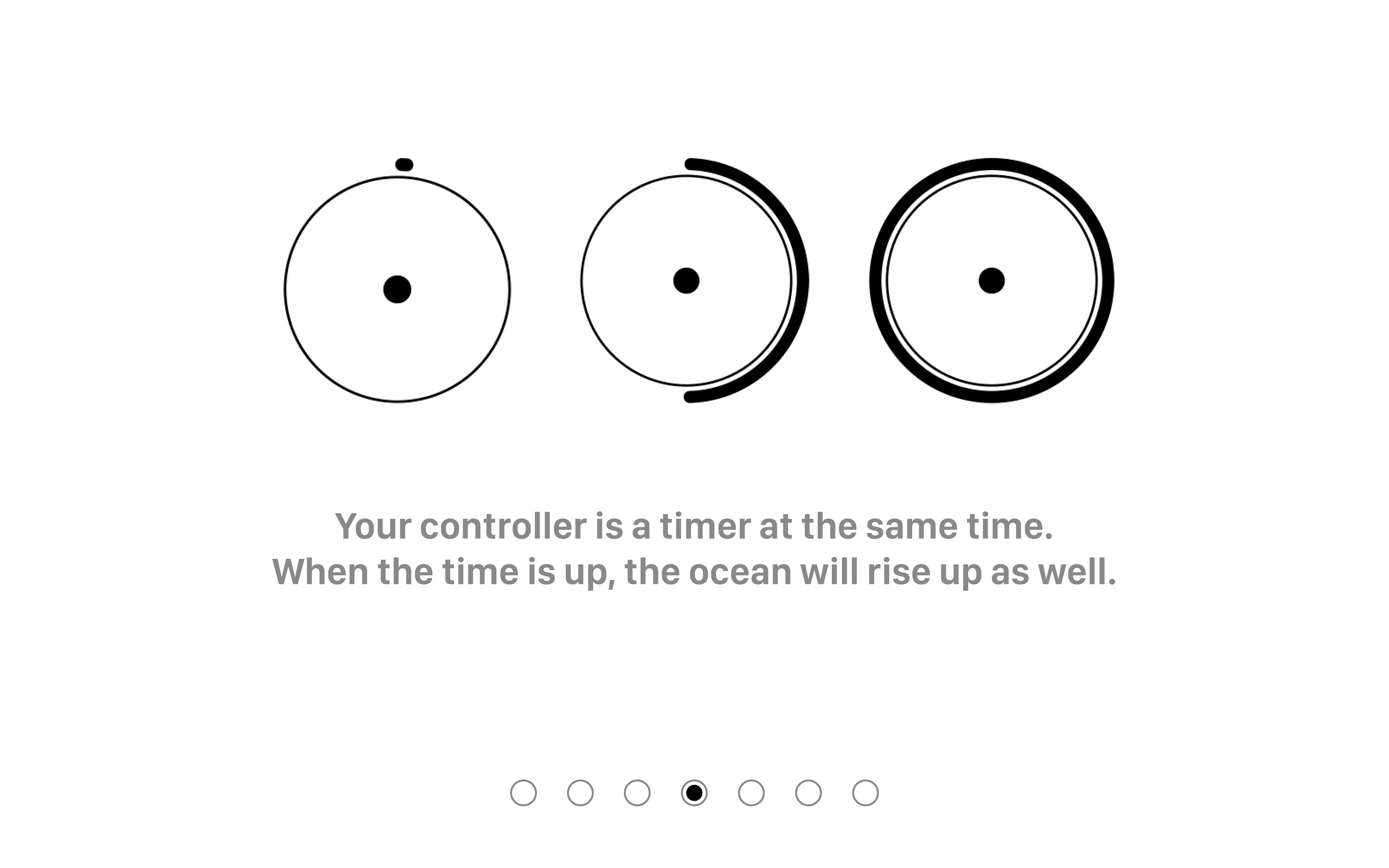
On the top of the screen is a black bar with the definitions in white letters inside it. After starting the game, the player should look for the right letter part that the current definition fits to. The focus point should be moved with the controller and when it is on top of a letter, the ink can be shot with the button on the controller. The player has a time limit of 1 minute and should shoot as many right parts as possible.
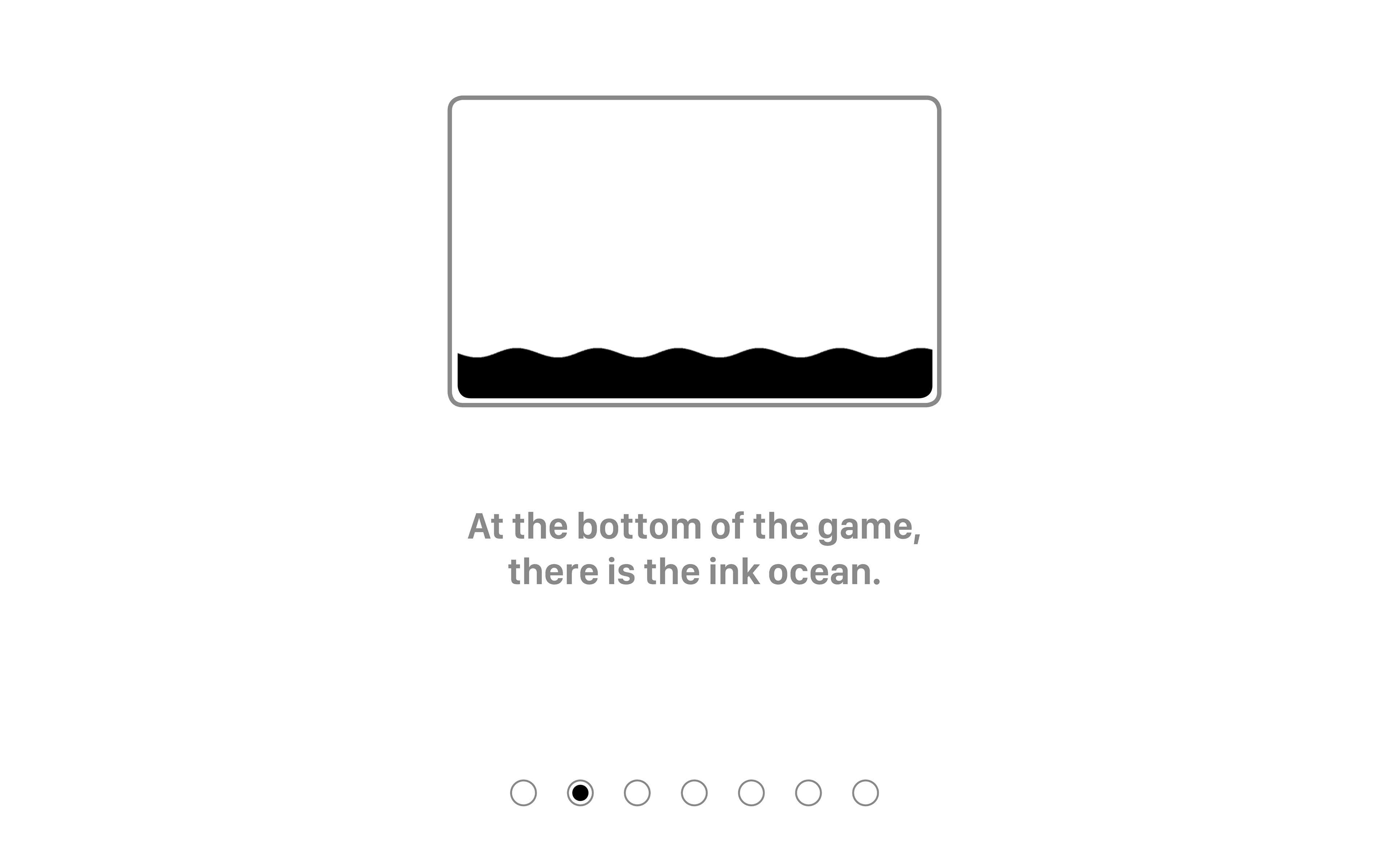
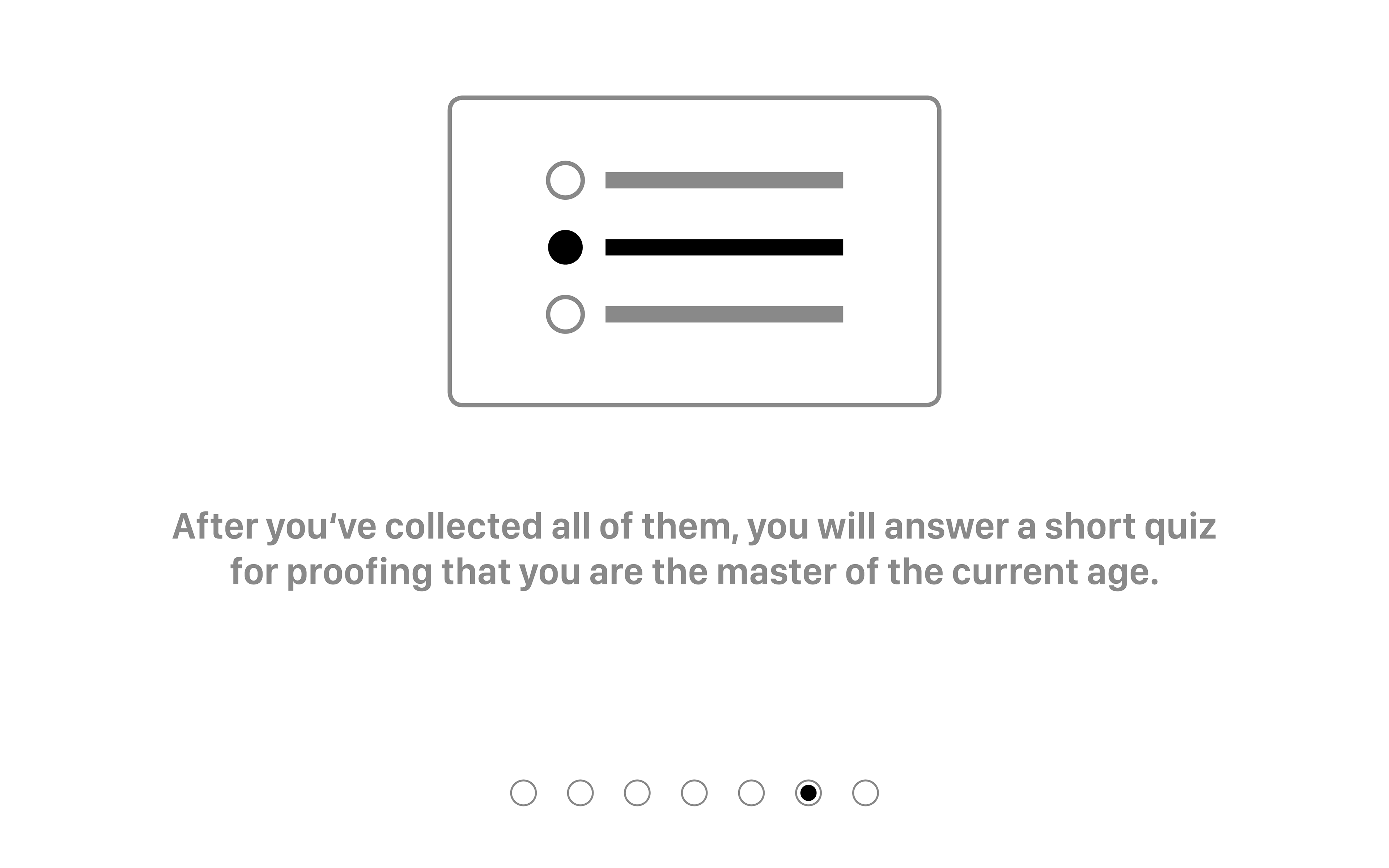
If the part was right, the ink would fill the part with an animation. If the part was wrong, the ink would splash and drop to the bottom. If the player shots on the layer, it would also drop to the bottom. On the bottom, there is an “ink ocean”, which fills up with every lost drop of ink.
The player holds a physical controller which is built out of a nintendo switch controller and a round box around it. The box is small and can be held easily with two hands. In the middle of the box is a little hole, where a piece of cork is placed in order to press the button on the nintendo switch inside the controller box. We had two iterations until the final prototype was built, because the first box was a bit too big and confusing because it was round and people thought it could be turned. That is why the last version has a flat side.

first prototype of the controller
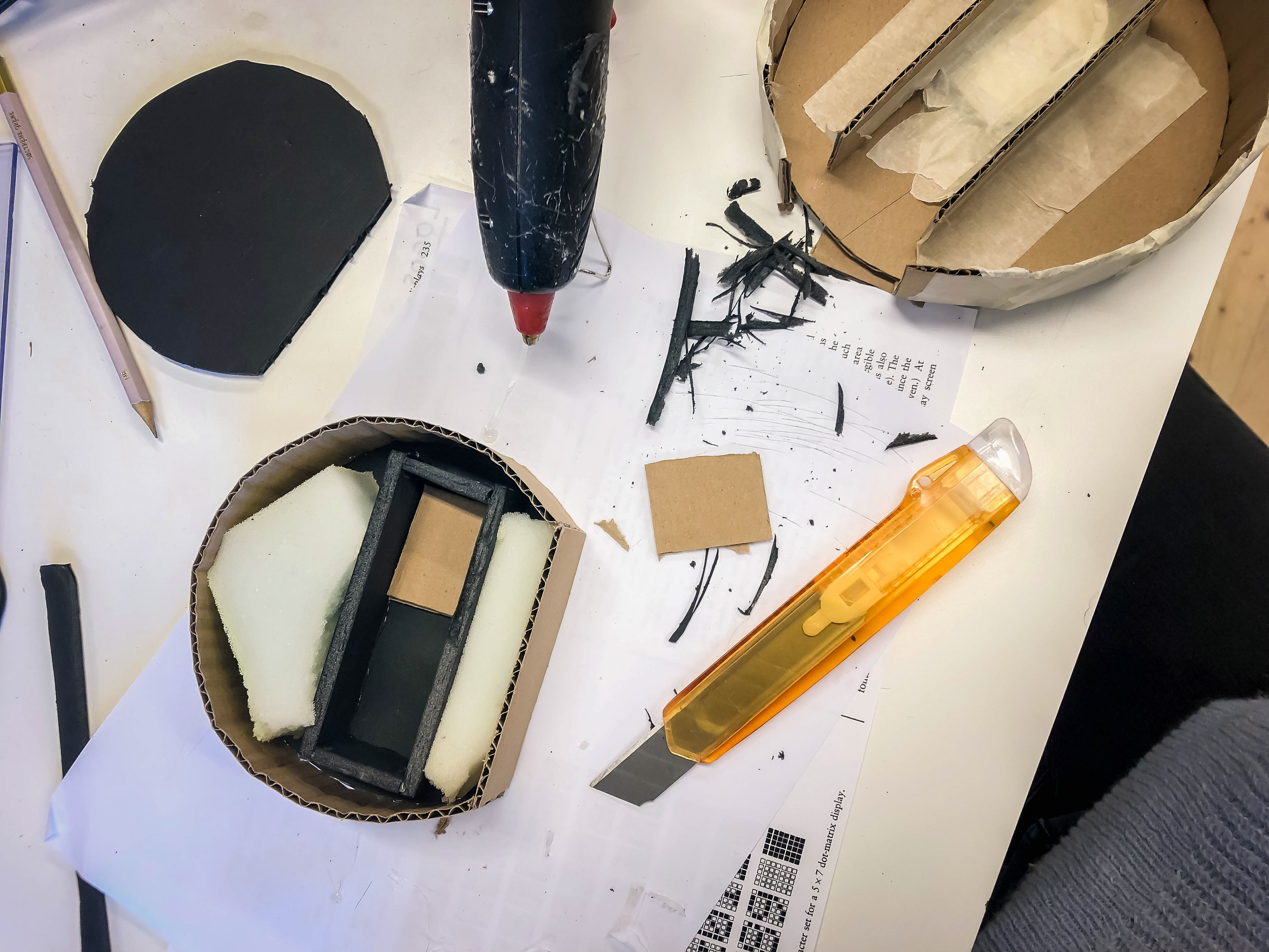
building the second prototype of the controller
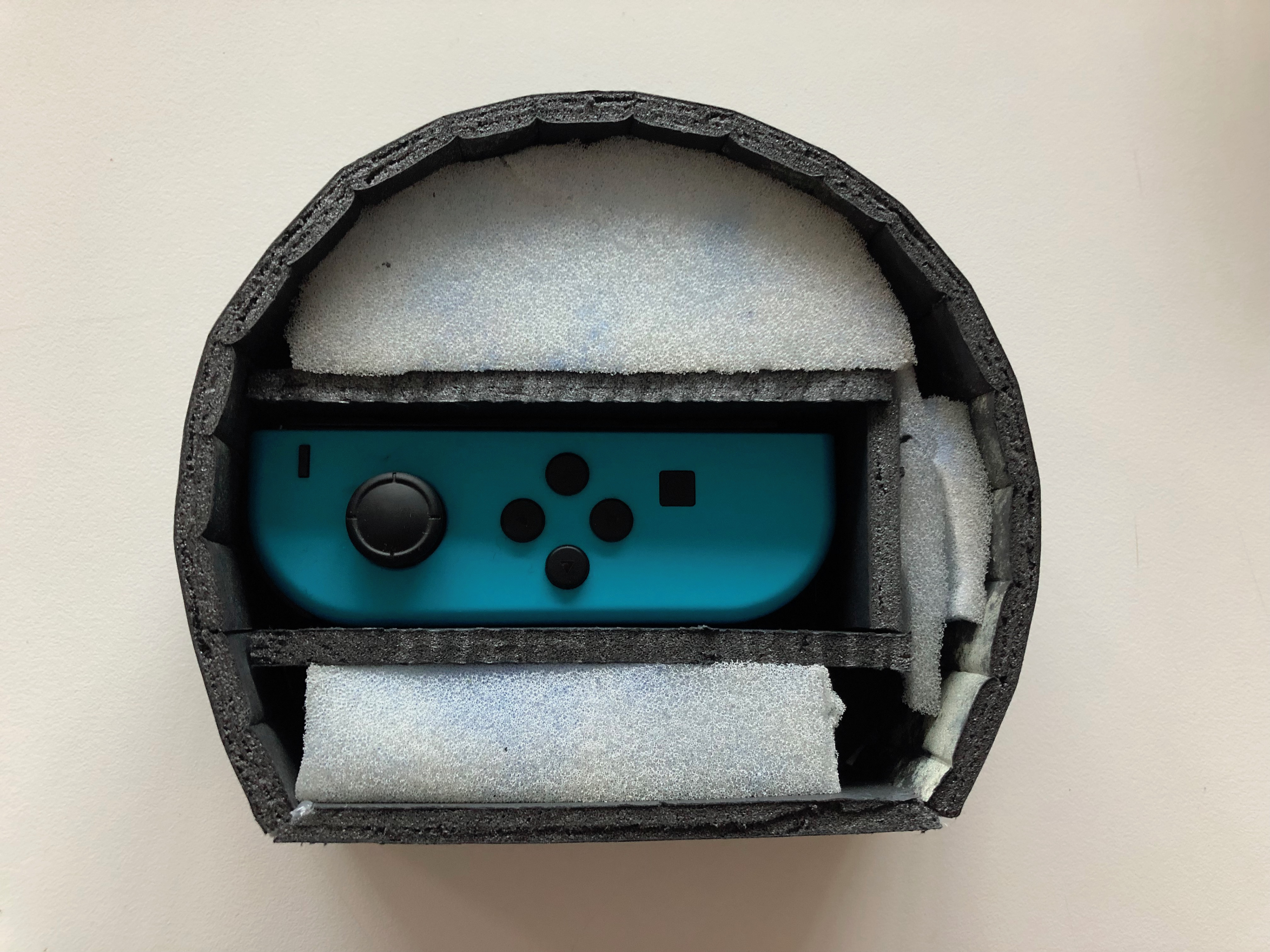
final prototype of the controller
PLAYTESTING
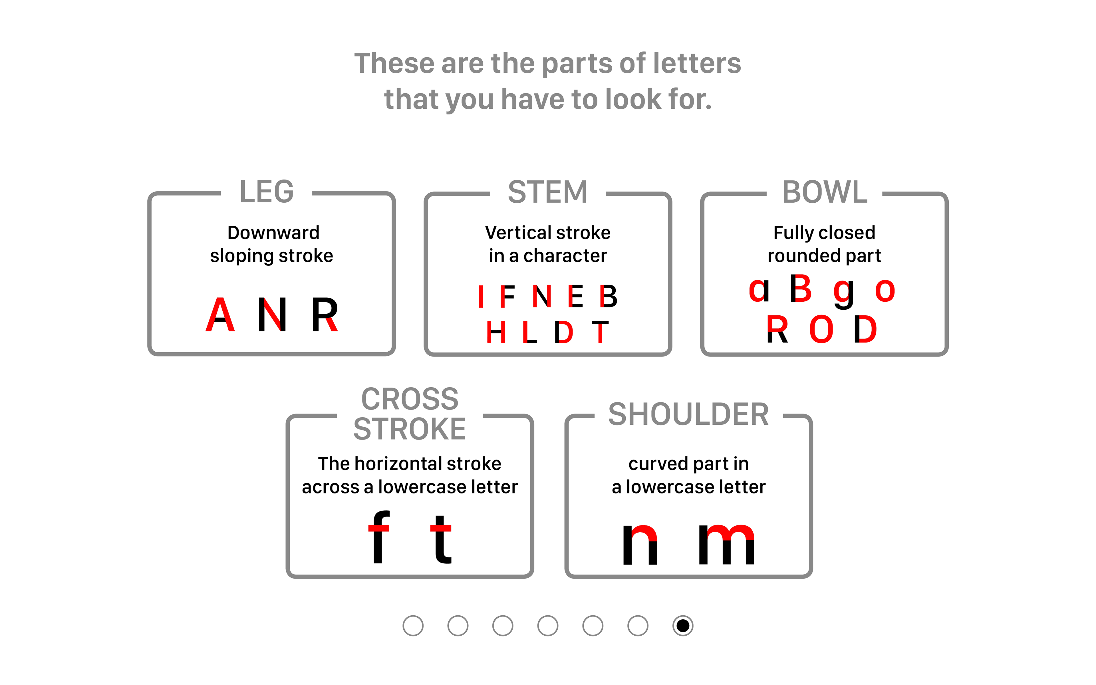
In the last weeks, we tested with classmates and in our group while working on different parts of the prototype. We discussed if we wanted to make a game for designers or an educational game for everyone. We figured out, that we need the easiest definitions with plenty of possible answers if the playtesters are not designers and don’t know anything about typefaces. That’s why we decided to use leg, cross stroke, bowl, shoulder and stem as definitions in the first level.
To help participants which don’t know the words and answers, we wrote the solutions on the wide board next to the game. We thought about having a kind of cheat sheet on one side of the interface in the first level of the game. Most parts of letters in the digital interface have a mask with an animation behind it and are assigned to one definition. Some letters are not needed in the game and are just in the interface to complete words.
Before the playtests we put together a few questions we wanted to ask the participants in the test session. In general, we wanted to know if the player understood the game (how to control it, the background, the goal). Also, we were interested in finding out if the game is fun for both design students and other students. Through the interviews and also the observation of the body language, we wanted to answer the questions.
Some of our important questions were:
- How did it feel to move the circle (frame) around?
- How did the movement feel like when shooting the ink?
- Did you understand what to do? What was unclear?
- Was it hard to learn?
INSIGHTS
All testers said that they need more feedback which time it is wrong and which the right part. They missed a few game features such as score, lives, as well as typography descriptions. We learned that having the objective of the game close to the aim circle wasn’t a good idea, neither would having the letter become highlighted to show you where the target would be since it would counter the effect of learning and memorising the different characteristics. Instead, it is good to help with a ”hint” before the game begins or in the margin of the game canvas.
The movement feels dynamic – slow and fast movement feel precisely like that in the game. Everyone keeps playing until we said they can stop if they want – which was a sign that they are having the flow in the game.
FINAL PROTOTYPE
After the playtests, we knew that our main focus for further development should be on adding and changing feedback: The feedback for hitting and missing the letters was a bit unclear. Also the level design would contribute the game making it more connected to the background and words and make the user understand how it relates to the historical content in a better way, so we implemented these too for the final prototype.